Reviews and social proof in general is critical to any business, big or small. Your customers are a lot smarter and the first thing they usually do is check your reviews whether on Google or any other review platform. In this guide, we’ll focus mainly on Google; since Google is the most popular place people check first for reviews on a business.
What are Google reviews?
For those unfamiliar with Google reviews, Google offers businesses to add their businesses on Google Maps and to show up on Google search results via “Google My Business”, GMB for short.
It is a great asset to have, and you can add your business whether you have a physical address or not.
Benefits of Google reviews
Beside the social proof aspect we discussed earlier, having a GMB (Google My Business) profile is very important for your website. Especially if you are a local based business. How else are your local customers supposed to find you on Google Maps and on Google itself?
Having a well optimized GMB and reviews also enlists authority to your website and thus helping you rank higher on Google.
Getting a QR code for your Google reviews:
Below we’ll discuss 3 different ways to getting your Google reviews QR code.
Otix
Otix is a QR code generator which automatically generates a QR code for your business’ Google reviews and links directly to the review form itself. This is our favorite and easiest way to generate a QR code for your Google reviews. Watch the video below to see how easy it is:
DIY QR Code Generation
Another good option is to retrieve the review URL from your GMB profile and paste it into a QR code generator tool to generate the QR code. There are thousands of QR code generators out there, both free and paid versions. Choose the one you’re most comfortable with and use that platform.
Here’s how to get your review link from your GMB profile:
- Go on Google or type in the search bar “Google My Business“. If you’re logged into Google with the same email address used to manage your GMB profile, then you can type your business name in the search bar and you will see the “Your business on Google” panel.
- Within the list, click on the “Ask for reviews” button. This is usually the last button on the far right.
- A pop-up window will open and display your review URL, copy the generated URL, as we will need it in the next step.
- Go to your favorite QR code generator tool, paste the generated URL from above and voila! Now you have a QR code for your Google reviews.
How to share the QR code with my customers?
There are lots of ways to share your QR code with your customers. You can get creative here and there really isn’t a right or wrong way. As long as the QR code is visible and scannable.
Here are some of our favorite ways:
- Save the QR code on your phone or have your staff save it on their phone. They can simply display it on their screens and ask the customers to scan it.
- Print it and display it on one of those acrylic stands you can buy from Amazon. Otix offers multiple designs and page sizes to accommodate different acrylic stands.
- Print it on your business cards. We’ve seen clients print the QR code on back of their business cards for easy access.
TL;DR:
QR code generation for your Google reviews is a fun and exciting way to collect reviews. We recommend Otix’s Google review QR code maker. It is simple, intuitive, and offers lots of ready to print templates.


 There are some questions that you should be asking yourself while designing your new logo, including “What kind of image do I want to project with my logo?” and “Who is my target audience?” By taking the time to ask yourself these questions, you will be able to get the answers you need to come up with a truly effective design that is going to benefit your business in a lot of different ways. These questions are paramount when it comes to creating a logo that will work for your company instead of against it.
 It’s also a good idea to spend some time looking at logos of successful companies so you can get a few ideas for your own logo. You obviously don’t want to just copy another company’s logo, but there is nothing wrong with drawing inspiration from others. If a company is very successful, chances are it has a brilliant and effective logo. Take as much time as you need to do this research, because it could benefit you greatly. There is nothing like learning from other companies and what they are doing right to make yourself successful.
 The right font can make or break a logo, so you will need to keep that in mind when you are going about designing yours. You will of course want to avoid any silly or over-the-top fonts like Comic Sans, but it’s important to choose a certain one that will make people take your business seriously. You should also consider which specific font best suites the particular type of business that you are running. The last thing you want to do is select a font that will flash with the rest of your logo or look inappropriate for your business as a whole.
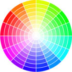
 You might also want to think about providing the designer you have hired with some color suggestions for your logo. This will ultimately increase the chances of getting the kind of logo you want for your business while cutting down on the cost of hiring a professional for this type of job. Think about which colors best represent your business and what it’s all about. If your business is related to the environment, you might want to have various shades of green and blue be prominent in your logo.
 If you have some artistic ability, you might want to just do all of the design work yourself when it comes to your new logo. This can save you a ton of money, but it’s important that you’re confident in your abilities. Not everyone is capable of doing this kind of work, and there is absolutely no shame in hiring someone else for the job. If you are artistically inclined, designing your own logo is probably the best option in terms of saving money while getting the exact kind of logo you want.
 One of the best reasons for you to focus on designing the best possible logo is so you can make a truly good first impression on those who see it. A poor logo will make a poor first impression, which instantly decreases the chances of people looking into your business any further. If you want to attract as many customers as possible, you will absolutely need to have a great logo.
 A lot of people tend to trust businesses with professional-looking logos, which is all the more reason for you to focus on making yours as sharp as possible. Make sure that your logo exudes professionalism and that it’s not too whimsical or silly. A serious logo will make people take your business seriously. It can be difficult to earn the trust of people who are on the fence about your business, but with the right logo you can get them on your side.
 A good logo can help your business to stay afloat, but a great logo will help it to thrive. While it’s true that there is more to running a successful business than just having an impressive and effective logo, it is a good first step. If you want your business to do really well (and of course you do), you will need to spend some time coming up with a great one that will really draw in new customers. The logo that you come up with can actually have a huge effect when it comes to how well your business does overall.
 It is important that you first understand why it’s so crucial that you have a strong logo for your business. A good logo can seriously increase your chances of succeeding with your business, so you will therefore want to know why it’s so crucial that you design the best one possible.
 It’s important to keep in mind that when you sit down to design your logo, you don’t have to finish it before getting back up. Take some time to just come up with a rough first sketch of your design so that you can just get a sense as to what it’s going to look like overall. Don’t pressure yourself into creating the perfect logo within the first 15 or 20 minutes of sitting down at your computer. Keep in mind that it also might be a good idea to sketch out your design on paper before going digital.
 One of the best pieces of advice you will ever get when it comes to designing your own logo is to not rush the process. There is nothing wrong with taking a few days or even a week to design your logo, simply because of how important to your business it is going to be. The last thing you want to do is rush this process and as a result have a sub-par logo that won’t really benefit your business in any real way.
 If the logo that you are currently using for your business makes people feel like they have stepped back in time, it’s important a good idea to at least think about redesigning it. The fact is that trends and tastes don’t usually last very long, and if yours is based on one of those then you will most likely need to update it at some point. The last thing you want is for people to not be able to relate or connect with your logo because it’s so outdated.
 It is important that you follow some basic yet effective tips when it comes to redesigning your logo so that you can make it look perfect. If you really want your logo to work for your business, you will need to keep these things in mind during the design process.
 You should also make a point of comparing the new logo that you have come up with against your old one to make sure that they don’t look similar. The last thing you want to do is to create a logo that is basically the same as the one you are trying to replace. A lot of people who go about updating their business’s logo subconsciously implement some of the same elements from their old one, and that is something you will want to avoid altogether.
 By updating your logo to something that is more attractive and/or relevant, you will be able to make a good first impression on those who see it. You should think of your logo as being your business’s handshake. A lot of people judge businesses based on their logos alone, so you will want to keep that in mind.
 Typography is a very important aspect of coming up with the right logo for your business, but there are a lot of mistakes that you can make that are important to avoid. Your logo’s overall design should be as simple as possible, because there is no reason to over-complicate things. Stay away from using too many fonts or weights, because otherwise your logo could get seriously cluttered very quickly. The last thing you want is for there to be too much going on in one small space.
 You will also need to avoid making your logo too complex and confusing. The last thing you want to do is to make your logo difficult to understand or interpret for those who see it. It’s always good to keep in mind that you should try to keep your design as simple as possible. While it might be tempting to come up with a fancy and convoluted design to impress people, it will end up having the opposite effect. Your logo should have a nice clean look that people can easily understand right away.
 While there is absolutely nothing wrong with borrowing ideas from other business’s logos, you will definitely want to avoid outright stealing. Not only is this a bad idea because it will cause a lot of confusion for those who see it, but you could also face legal action from the company you stole from. One of the best ways to make sure that your logo stands out from all of the other companies in your industry is to come up with a wholly original idea. You can spend some time looking at other company’s logos to get general ideas for yours, but don’t take it too far.